It’s your friendly KF on KND Editor April Hamilton here, continuing KF on KND’s series about the new, 5th generation line of Fire tablets. I’d originally intended this series to run for a week, but there’s so much to share I’m going to have to continue into next week with posts about Apps/Games and Music!
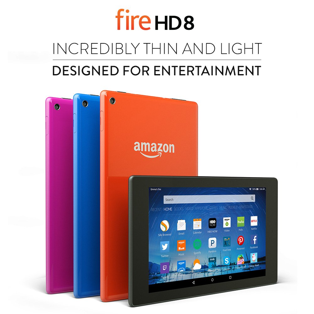
Today I’m sharing information about the new Books home page and Kindle Reader updates. My observations are based on testing a Fire HD 8 (the one pictured at left), but the new operating system is the same across all the new models so what you see here should be applicable to all the new Fires.
Where identifying details appear in the screenshots from my own tablet, I’ve placed a gray box over them; the gray box(es) will not be there on your own Fire screens. Tap or click on images below to view full screens in a new tab or window.
Books Home Page
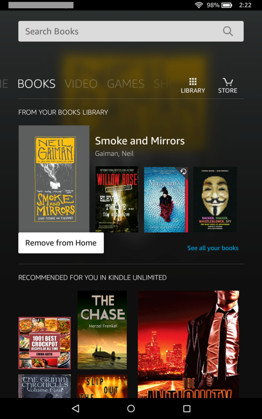
The Books home page, accessed by tapping the Books link in the top menu ribbon from any system screen (as opposed to screens within apps, books, games, videos, etc.), has been redesigned.
In the screenshot below, I’ve long-tapped on a book that I had not yet downloaded. Notice that the only popup menu option is “Remove From Home”.
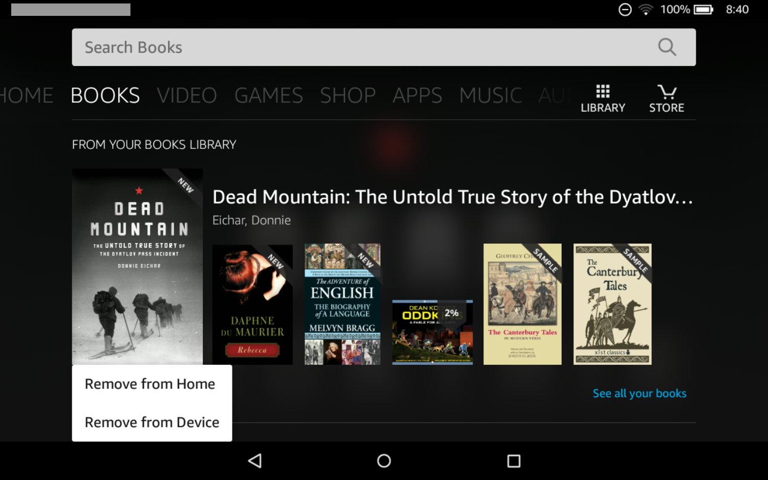
Here, I’ve long-tapped on a book that I had downloaded, and as you can see there’s also a “Remove from Device” option.
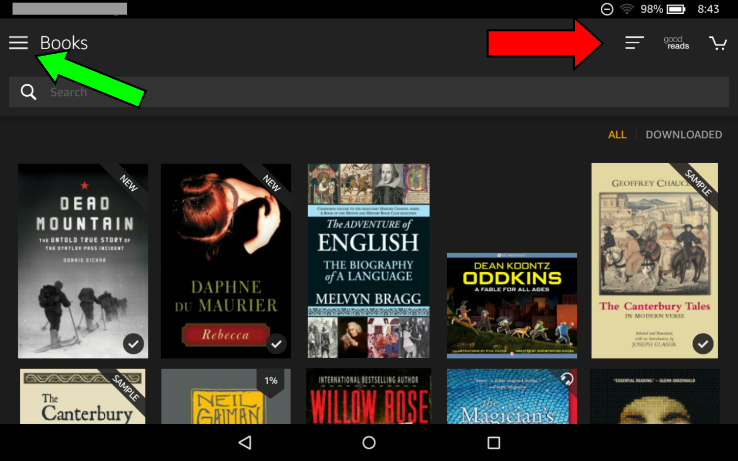
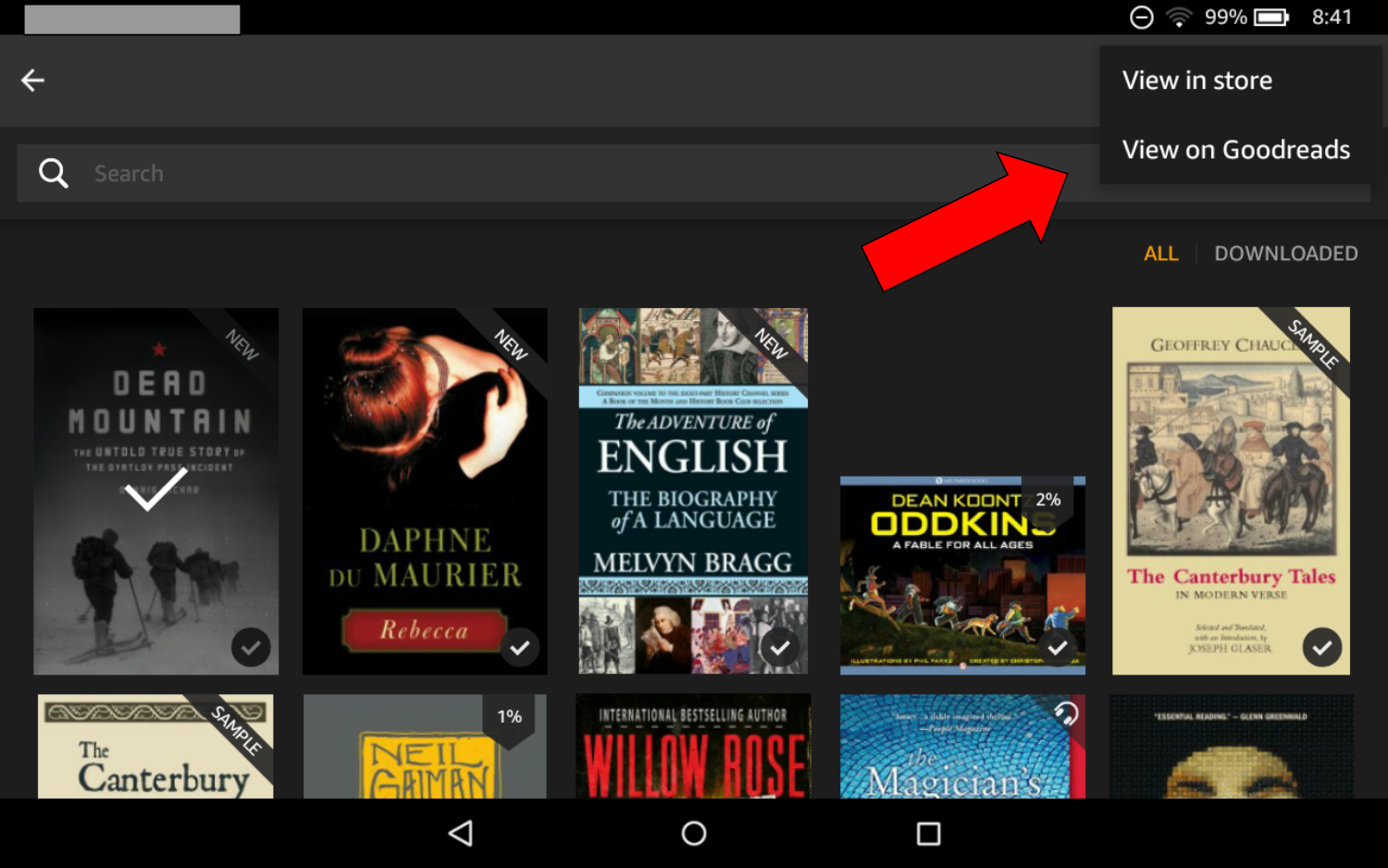
Here, I’ve tapped the Library icon shown in the previous two screens. There are two menus available here, indicated by the arrows. The green arrow points to the icon that will open the Library sidebar menu, which is pretty much the same as in the previous generation Fires. The menu to the right (red arrow) has a options to sort your library, open the Goodreads app or visit the Kindle Store on Amazon.
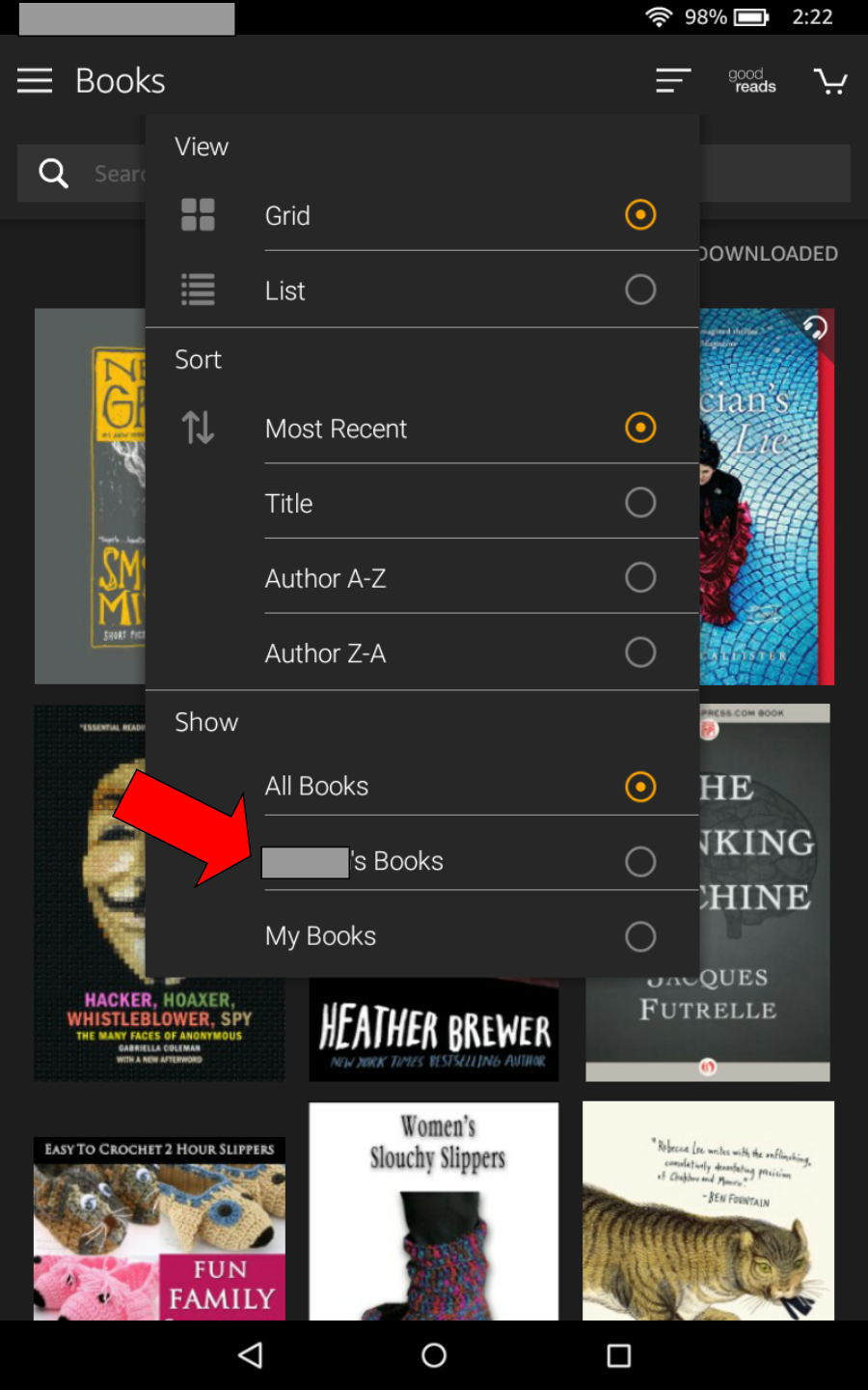
This is the sort menu, accessed by tapping the Sort icon. If you’ve set up a Household, where family members share content across their devices, other Household members’ libraries can be accessed via the Show option (red arrow). Here, I have a Household set up but I’ve grayed out the family member’s name.
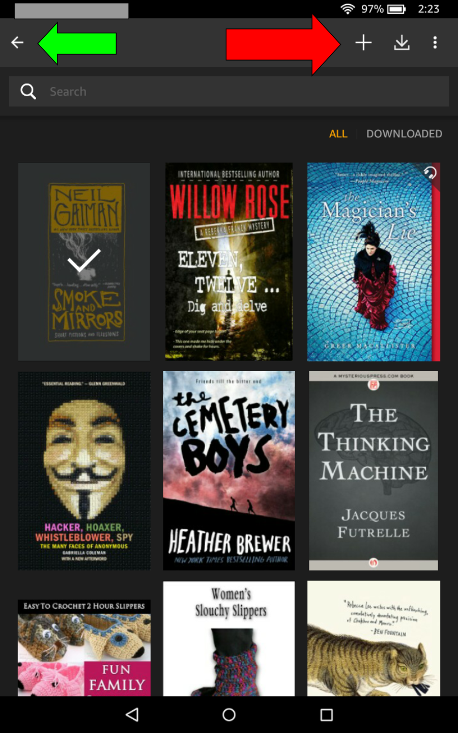
When you long-tap on any book shown in your Library, a context-sensitive menu displays (red arrow) to provide options for the selected book. The plus sign opens the Add To Collections/Create Collection screen. The download icon downloads the selected book to your device. The 3-dot menu provides additional options (more detail below). The green arrow is pointing to the “back” icon, which you can use to go back to the Books home screen.
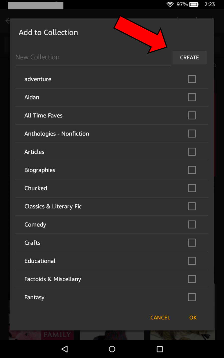
Here’s the Collections popup menu. Here you can add a selected book to existing Collections or create a new one (red arrow) and add the book to it.
Here’s that 3-dot menu.
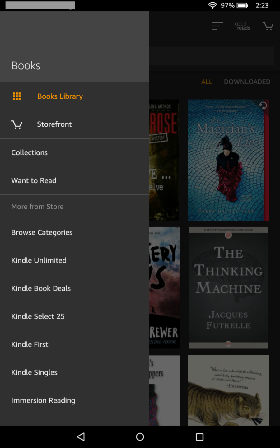
The screenshot below shows the Books > Library sidebar menu.
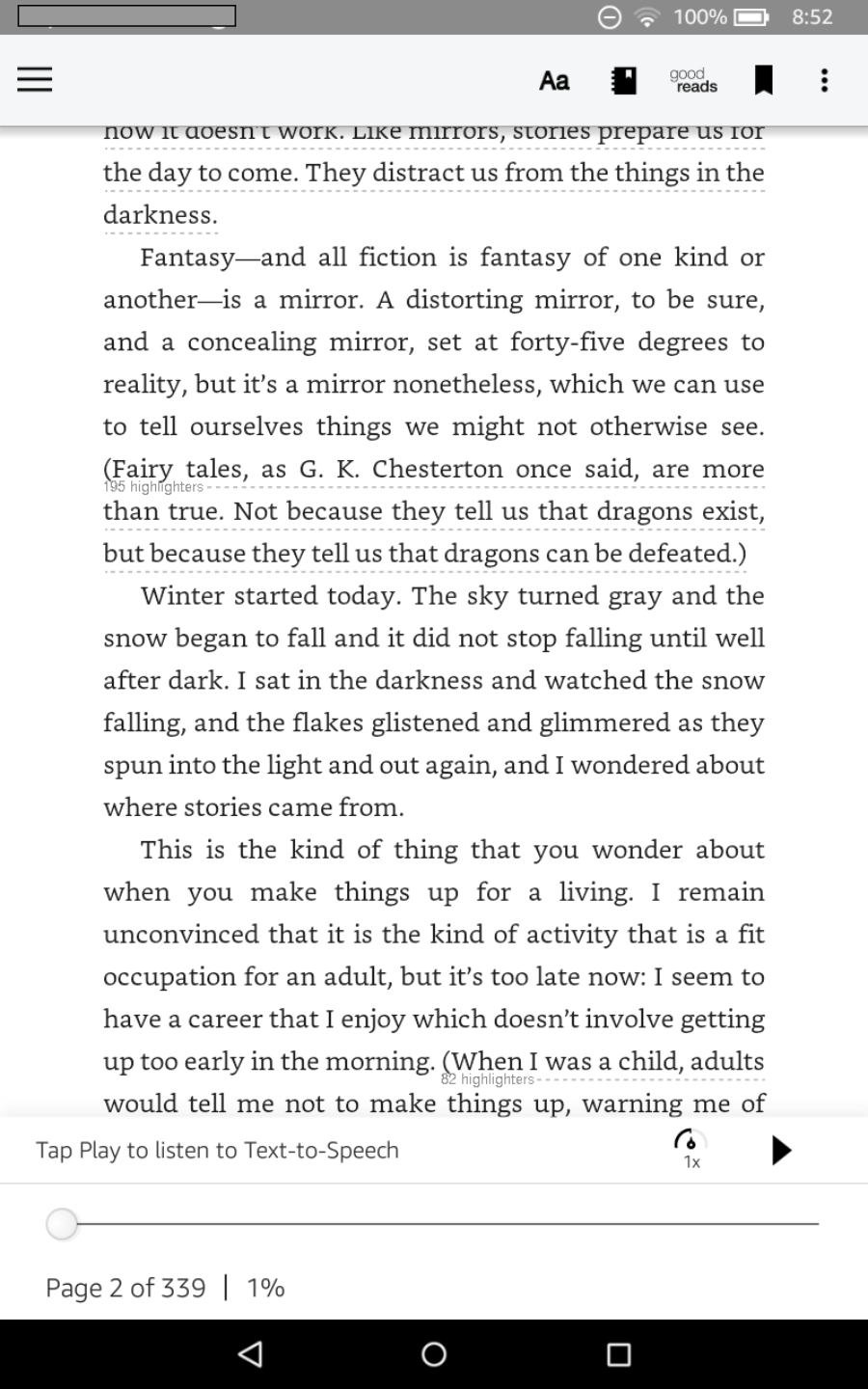
This is the standard reading screen you’ll see when you open a Kindle book. You probably already recognize most of the icons here.
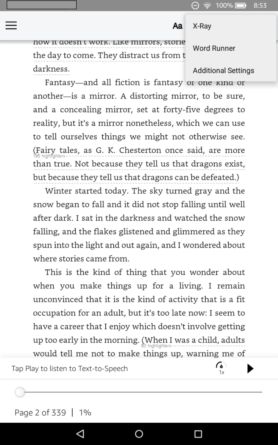
The 3-dot menu opens links for X-Ray, the new Word Runner feature (more on this below) and the Additional Settings menu.
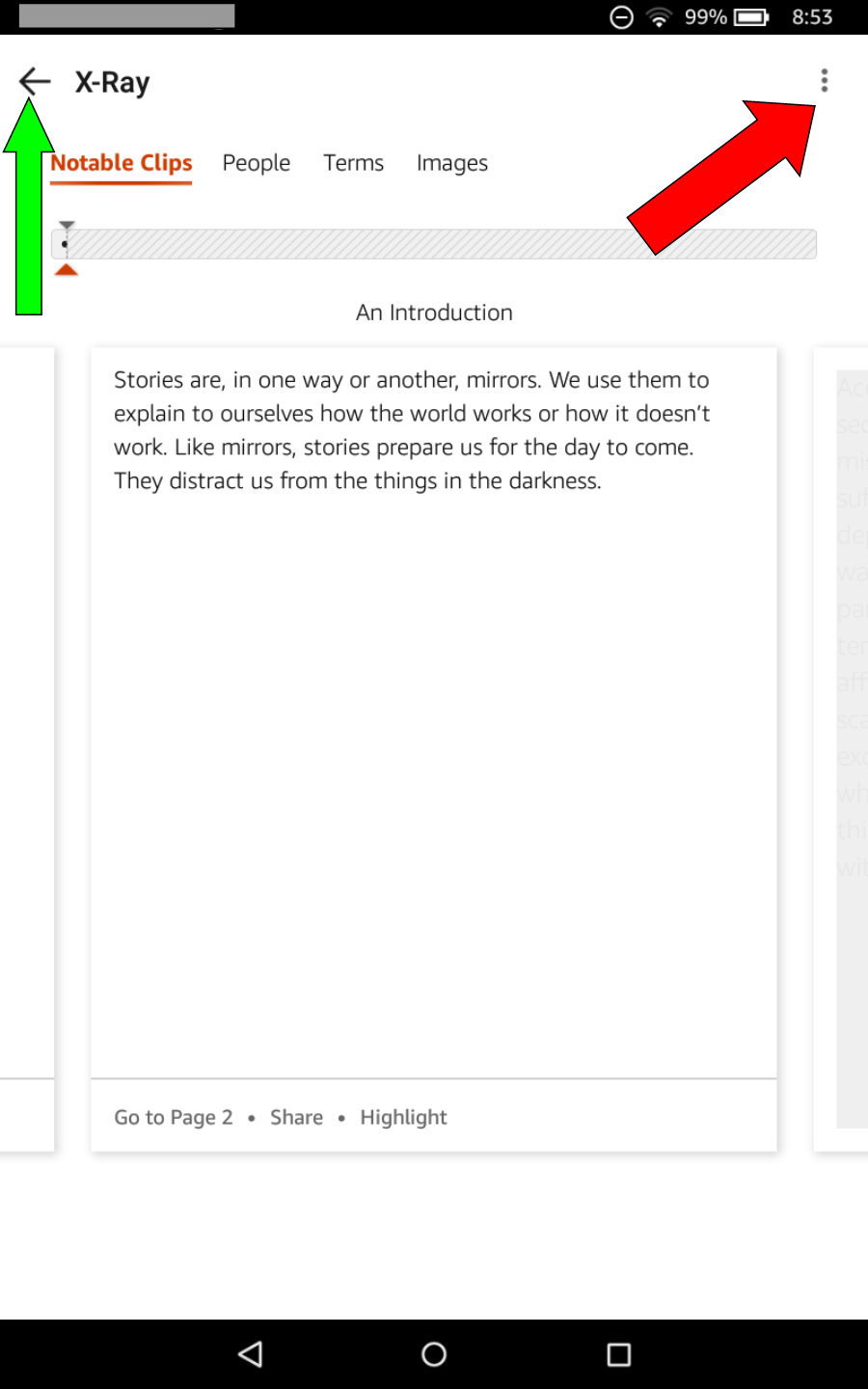
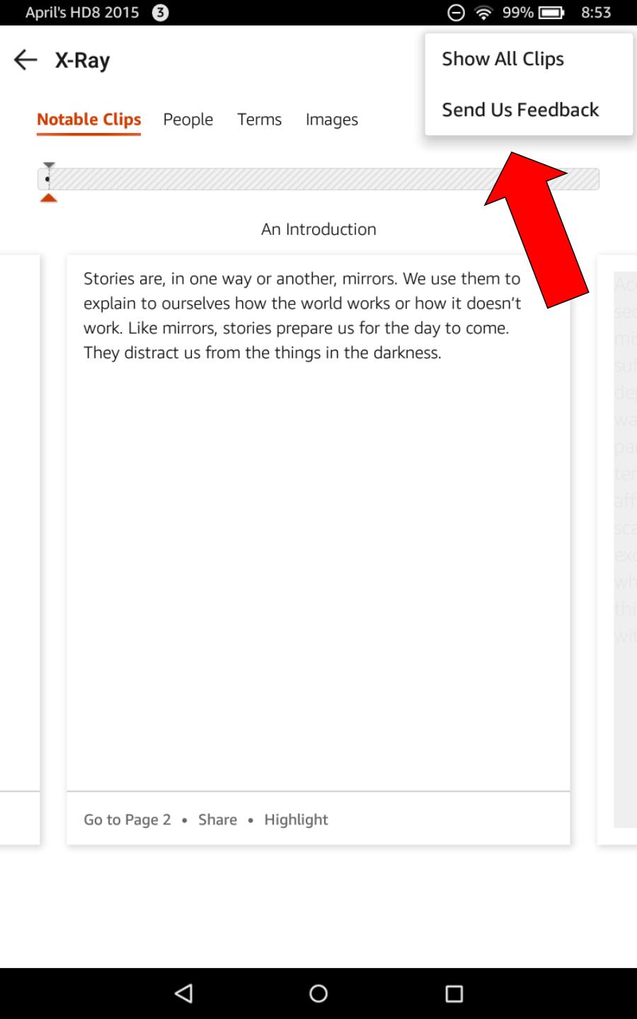
Here’s what you see when you tap the X-Ray link. The green arrow is pointing to the “back” icon, which you can tap to exit X-Ray. The red arrow points to the context-sensitive X-Ray menu link.
Here are the options in that context-sensitive X-Ray menu.
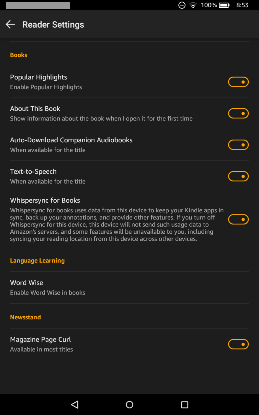
Here’s the Additional Settings menu. Tap the switch icons at the right to toggle options on (as shown, the switches will be highlighted orange) or off (they’ll be grayed out). Tap the Word Wise link to open the Word Wise options screen.
Word Runner: The New Speed Reading Feature
Word Runner is a speed reading application that runs right in the Kindle reader. Word Runner has been proven to increase reading speed in user tests, and it’s become very popular among people who have to do a lot of reading for work or school.
Personally, I find it very disorienting. I prefer to set my own pace while reading, choosing which words to linger on and which to skim in a given sentence myself, and I need to see entire sentences to do that. This may be because I’ve had some prior speed-reading training that was based on whole sentences though, so it’s worth giving Word Runner a try if you’d like to increase your reading speed.
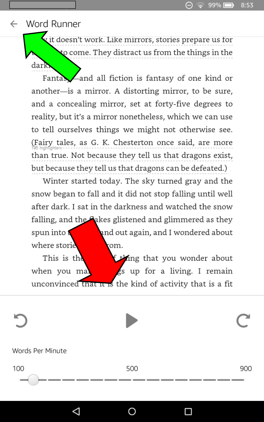
Below is a screenshot of what you’ll see when you tap the Word Runner link to start Word Runner. The green arrow is pointing to the “back” link, which you can tap to exit Word Runner. The red arrow is pointing to Word Runner controls. From left to right: Skip Back, Play/Pause, and Skip Forward.
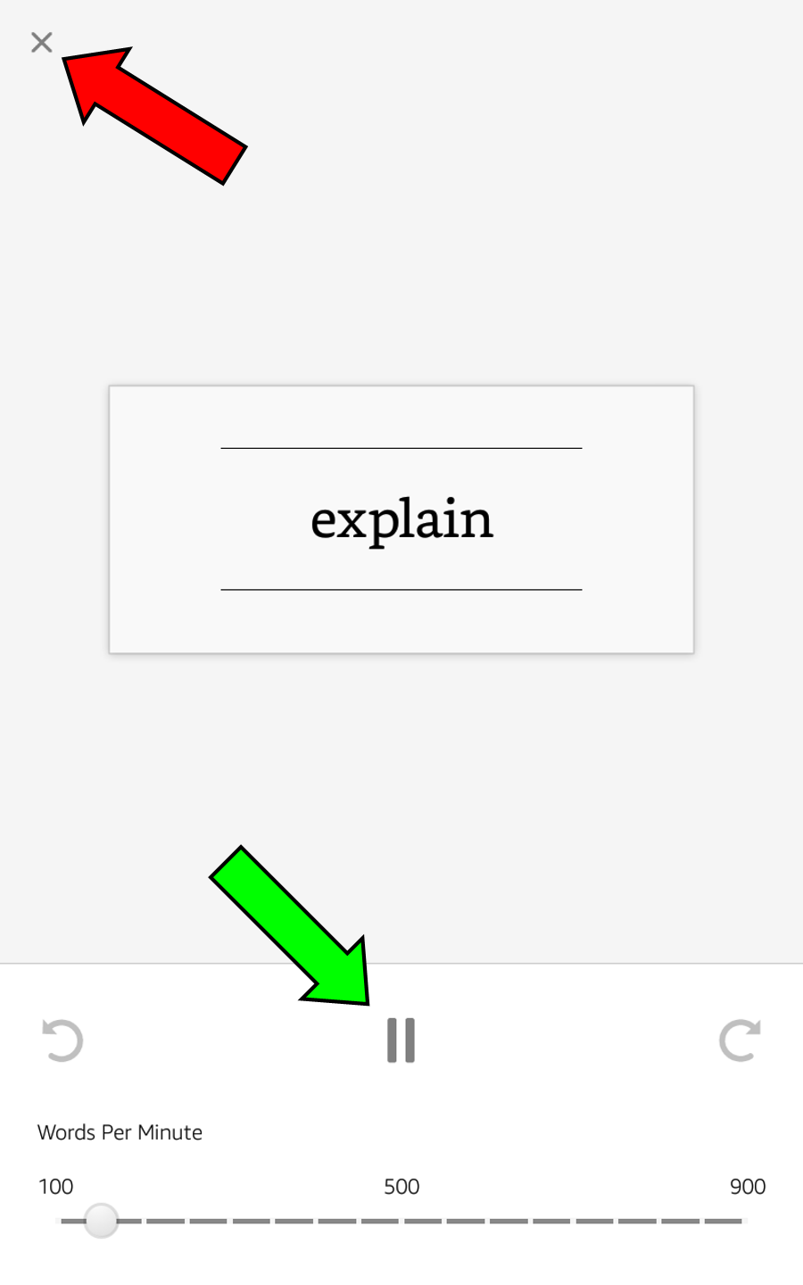
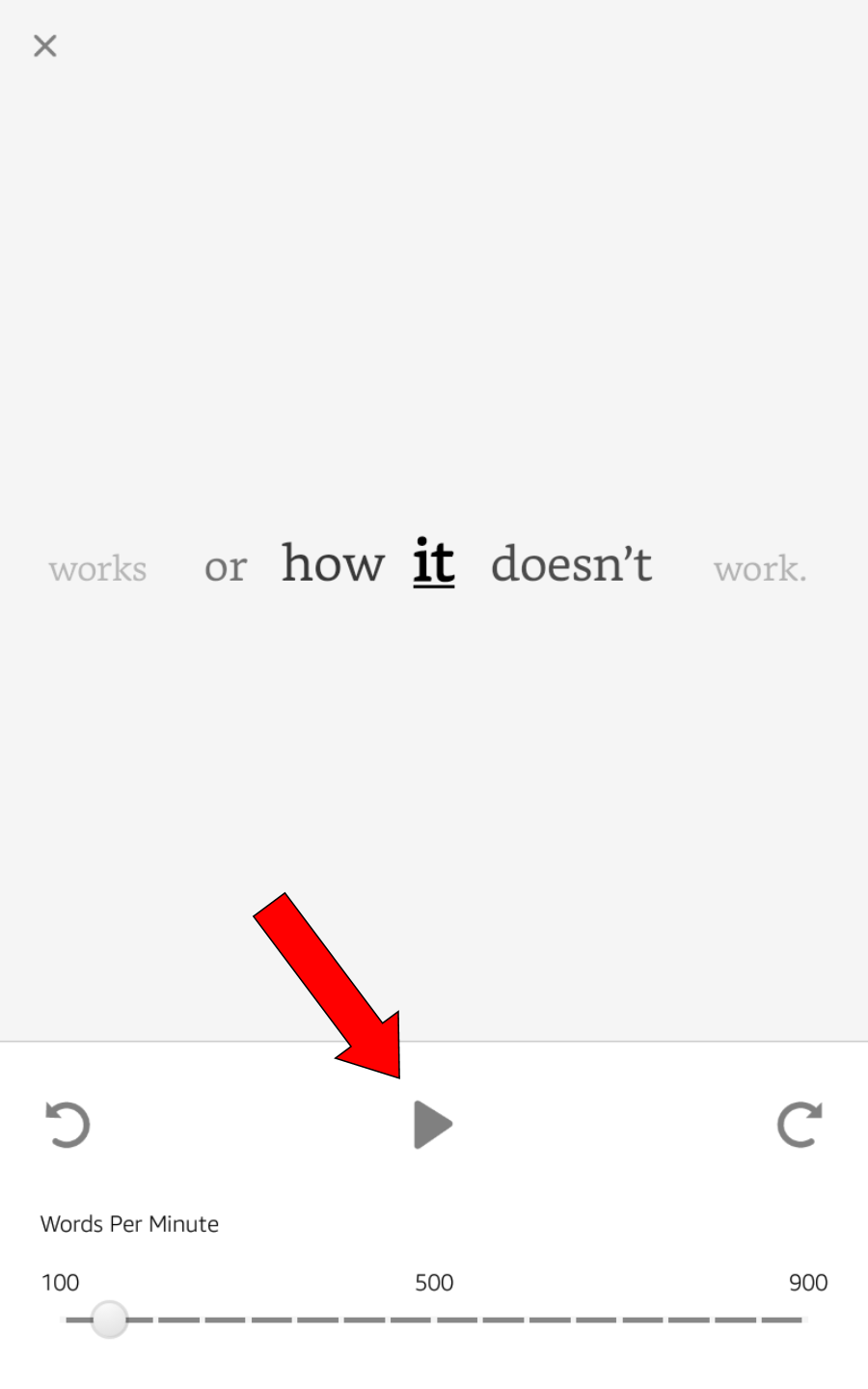
Tap Play to start Word Runner. When Word Runner is active, one word at a time is enlarged and displayed in the center of the screen for a couple seconds, and you can’t see any of the rest of the sentence, paragraph or page. You can adjust the length of time each word displays by tapping on your desired setting in the Words Per Minute bar at the bottom of the screen: set it to a lower number to make each word display longer, set it higher to speed things up.
The red arrow shows where the “back” link icon has now changed to an “x”; tap the icon on any active Word Runner screens to exit Word Runner and return to normal reading. The green arrow shows where you can tap to pause, but not completely exit, Word Runner.
When you tap the pause icon, Word Runner stops and displays the word it showed you last, along with a couple of words before and after that one. Tap the play icon (red arrow) to resume Word Runner reading.
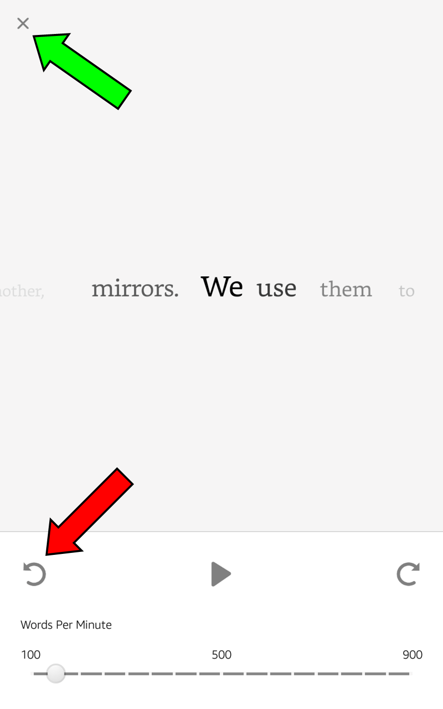
When Word Runner is paused and you tap the skip back icon (red arrow), the display shifts to the beginning of the current sentence. This is useful if you find yourself losing track of the narrative within a given sentence. The green arrow indicates the exit icon: tap it to close Word Runner and resume normal reading.
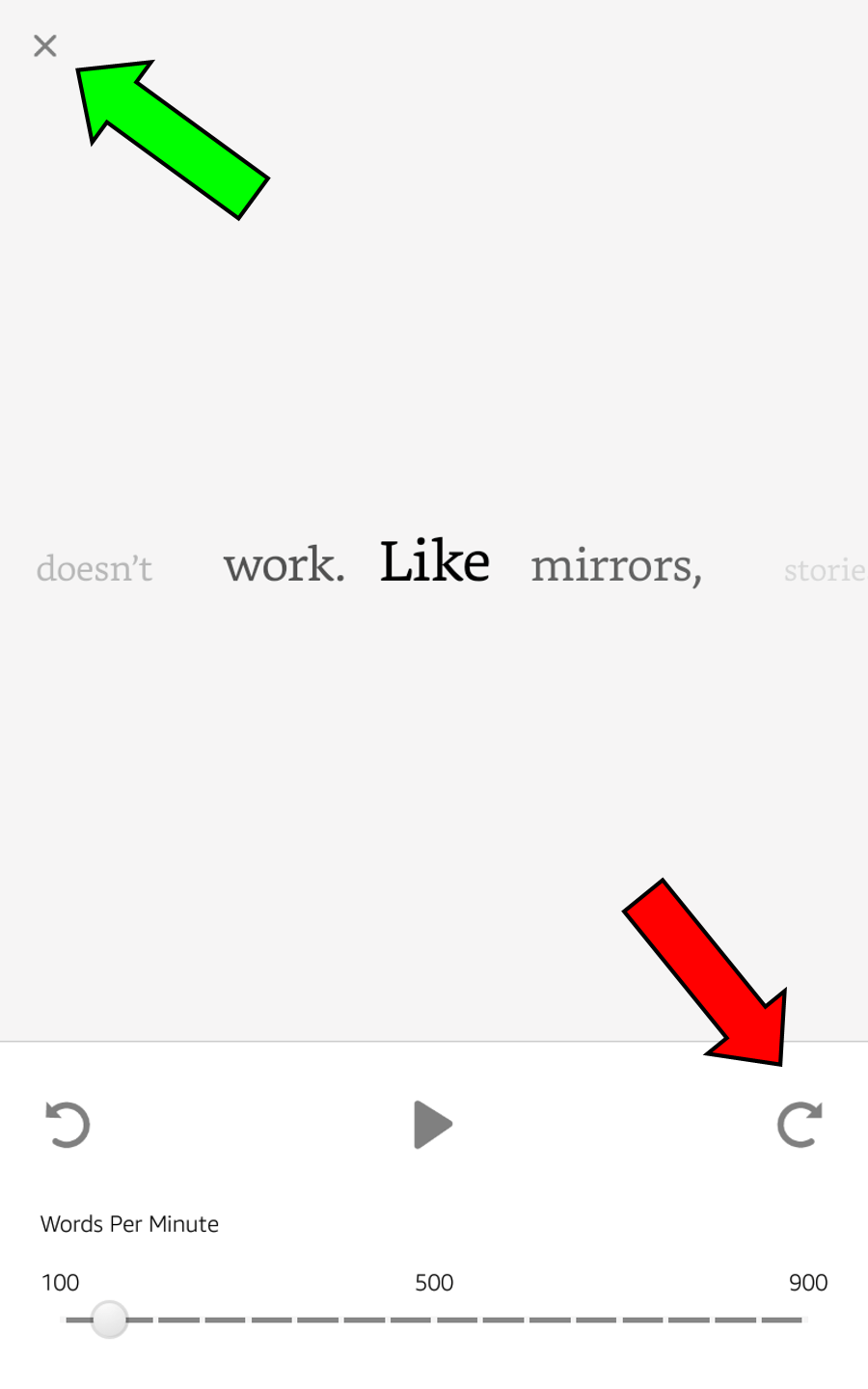
When Word Runner is paused and you tap the skip forward icon (red arrow), the display shifts to the start of the next sentence. The green arrow indicates the exit icon: tap it to close Word Runner and resume normal reading.
There you have it: everything you need to know about the new Books screens and menus, and the new Word Runner feature!
* * *
Tech Tip of the Week: Be Reasonable About The Limitations Of Tech
* * *

