It’s your friendly Editor April here. I’ve got one of the new, 2014 Fire HD6 tablets and have had the opportunity to test and compare it to my second-generation Kindle Fire HDX, so now I’m ready to share.
This will be a long and picture-filled post, but don’t be intimidated: the new Fire line has some improvements and changes, but it’s not a drastic departure from the previous generation. A lot of things look a little different and work a little different, and there are some new and improved features, that’s all.
Note that you can click or tap on images in this post to view an enlarged version in a new tab or window.
Device Management Options
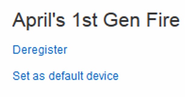
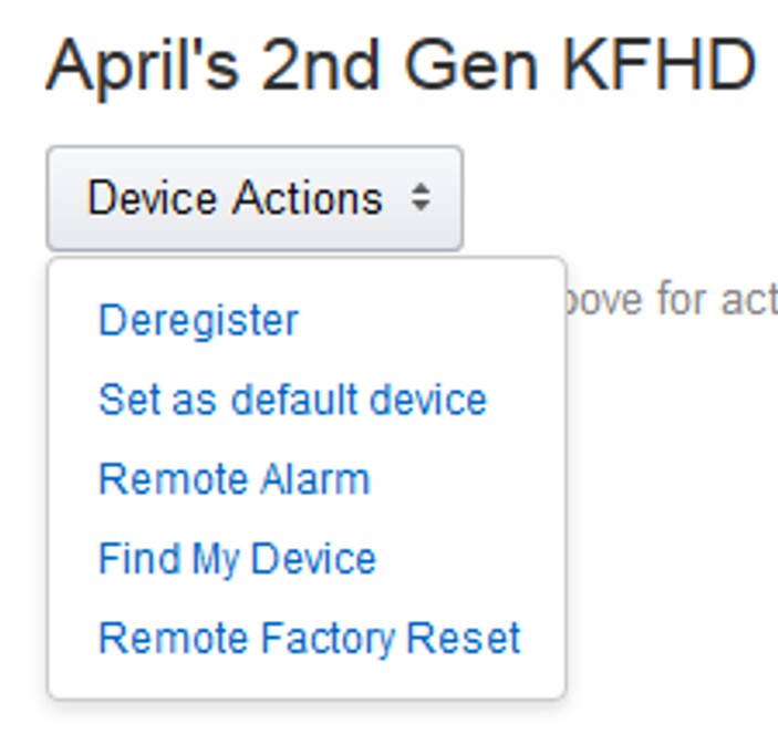
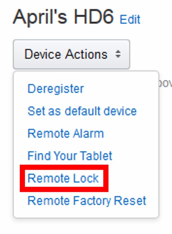
Let’s begin here. When you go to Your Account > Manage Your Content and Devices, the available options are different for different Fire models. Here they are, in order from first-generation to my 2014 HD6, which is one of the brand new models.
First-Generation Kindle Fire Device Options Menu:
Second-Generation Kindle Fire Device Options Menu (note the addition of “Remote Alarm”, “Find My Device” and “Remote Factory Reset”:
“Remote Alarm” sounds a loud chime on your Fire to help you find it when you know it’s nearby, but can’t spot it.
“Find My Device” only works if you have Location Based Services enabled on the Settings menu of the Fire. Many people turn this option off due to privacy concerns or to save battery life. If you want to be able to use “Find My Device” on a second-gen Fire, you must turn Location Based Services on under Settings on the tablet.
2014 Kindle Fire Device Options Menu (note the addition of “Remote Lock”):
The “Find Your Tablet” option is the same as the “Find My Device” option on second-gen Fires. To enable this on a 2014 Fire, on the device, under Settings > Device Options, turn on the “Find Your Tablet” option. It’s set to “off” by default. It’s not clear to me if doing this also enables ALL Location Based Services, but since I’m not finding a separate menu item for that option it’s probably safest to assume the answer is “yes”.
The new Fire line adds one more item: “Remote Lock”. This is used to lock your Fire remotely, in the event it’s lost or stolen, or you know you’ve left it in a non-secure location and have privacy concerns.
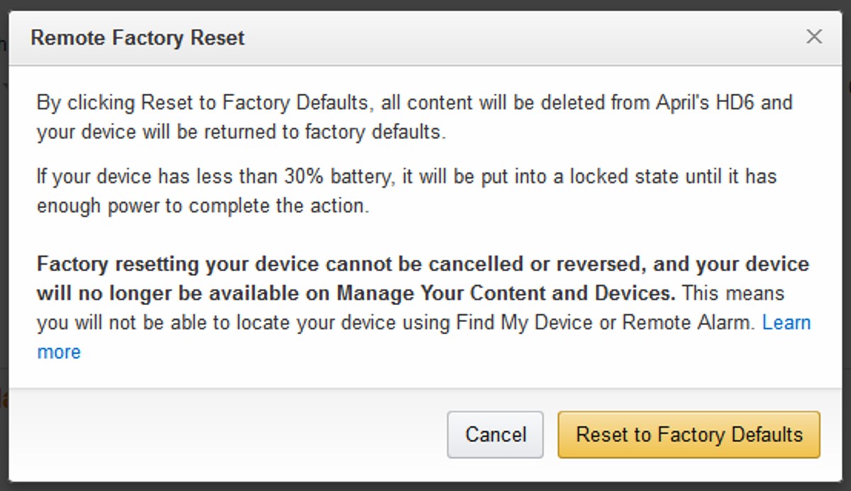
Here’s the detail screen for the Remote Factory Reset option, which is available on both second-generation Fires and the 2014 models:
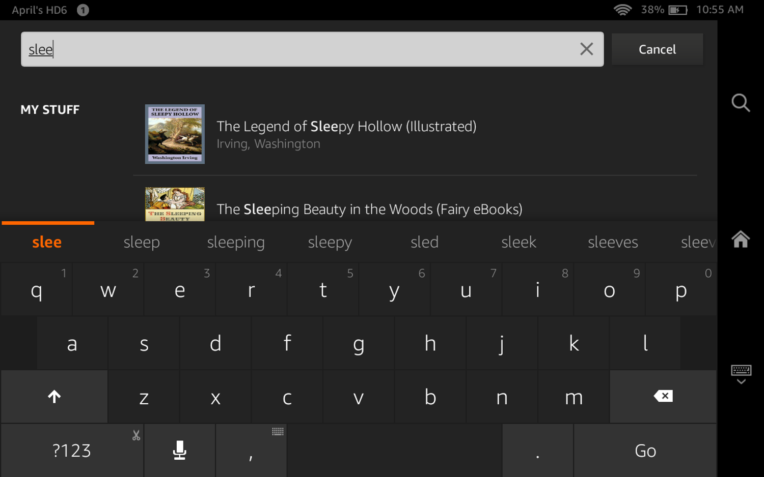
Below, you can see the new on-screen keyboard. Everything’s bigger and easier to read and use, but it works pretty much the same as in previous generation Fires. Note that little microphone icon to the right of the ?123 button at the lower left: yes, you can dictate your search terms (and emails, and text entries in online forms, etc. etc.) on the entry-level 2014 Fire. In the second generation, this was only available in the higher-end models. Just tap the microphone icon and start talking to enter your search term(s); the voice recognition software is surprisingly good.
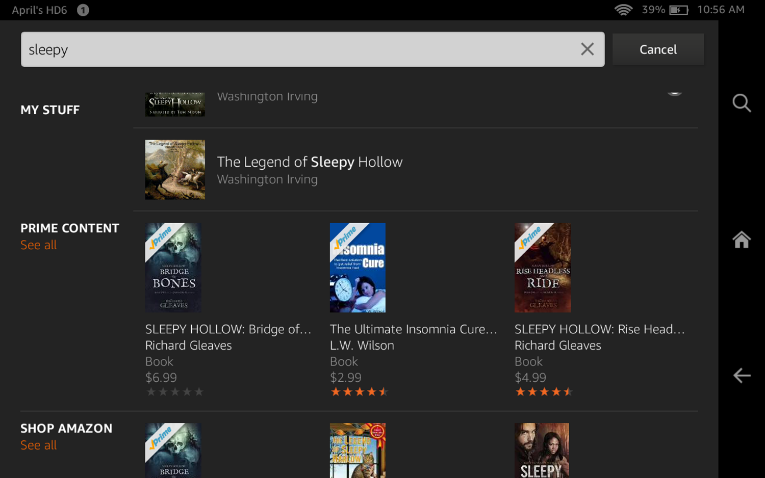
Here, I’ve closed the keyboard to display my search results. The results screen has been redesigned to make it easier to distinguish between search results that indicate matching content you already own (My Stuff), matching content that’s available through Amazon Prime (if you’re a Prime subscriber), and matching content available for purchase.
Select Options
The pictures tell the story for the most part, but I’ve added some comments to point out specific differences or improvements.
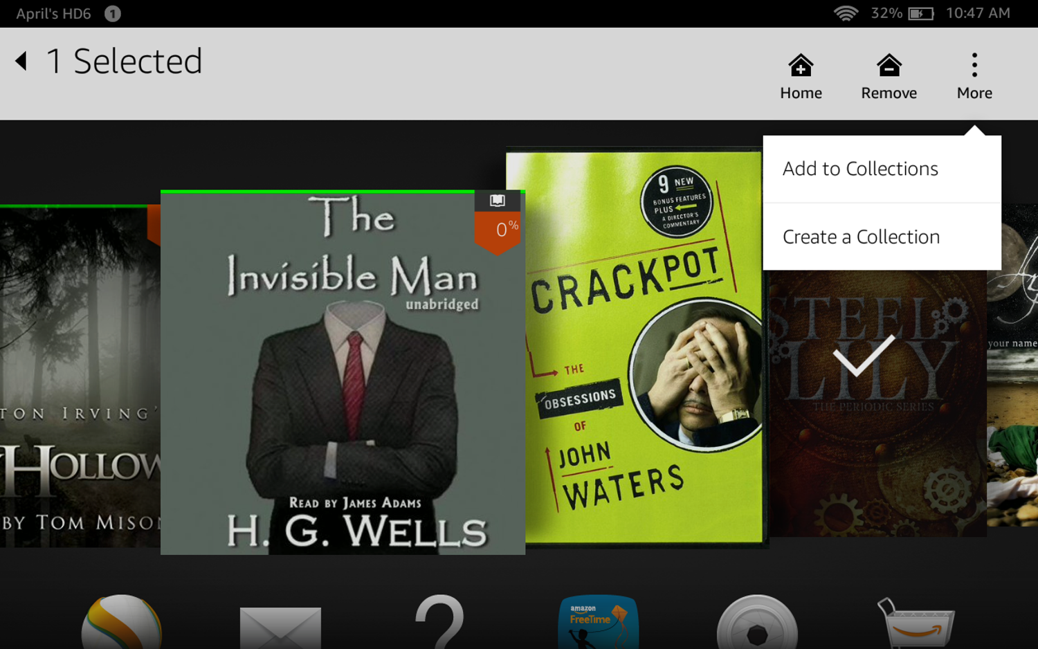
On the various main menu screens (e.g., Home/Carousel, Books, Videos, etc.), you still long-tap to select items but you no longer get the same pop-up menu right on top of the selected item. Instead, there’s a “Selected” ribbon that appears at the top of the screen and from there you can select Home (with a + sign) to add the selected item to the Home/Carousel screen, Home (with a – sign) to remove the selected item from the current screen, or access the Add to Collections / Create a Collection menu items by tapping More. To cancel, use the ‘back’ icon (at the far left of the ribbon, indicated by a red arrow in the next screenshot, below this one).
Note that there is no longer an option to “Remove From Device” or “Remove From Cloud” here. To delete content from the tablet but keep it in your Cloud library, you will have to access the content on the main [content type] > Device screen (e.g., Books > Device, Apps > Device, Videos > Device, etc.), then long-tap as usual to bring up the “Remove from Device” menu option. It also appears that under the new 2014 Fires’ operating system, the only way to permanently delete content from your Cloud library is to access Your Account > Manage Your Content and Devices on the Amazon site.
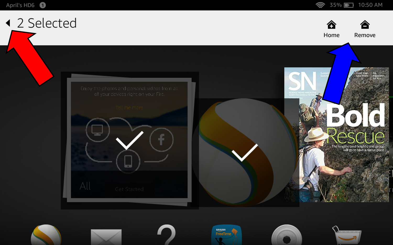
Here you see that you can select multiple items from a given screen, which is new with the 2014 Fire line. Just long-tap to select each item, then use the Select ribbon to apply the same changes to all selected items. To exit without making any changes, use the ‘back’ icon, as indicated by the red arrow below Note that the “More” menu item, where the Collections options are located, isn’t shown because in this case I’ve selected two items that don’t use the Collections feature. I also tested it with a Kindle book and Kindle magazine selected, and in that case the More menu item did appear.
Books Menu and Screen Improvements
There are a number of improvements, but they’re subtle.
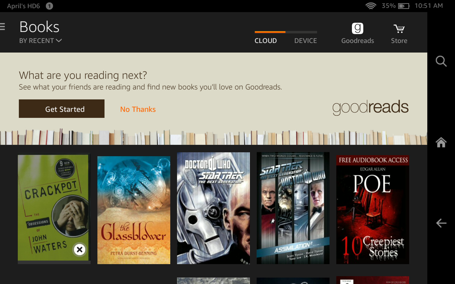
The first time you access the Books screen/tab, you’ll be prompted to enable Goodreads integration. If you already have a Goodreads account, just tap “Get Started” and your Fire will take care of the rest. If you’re wondering why no separate login is required, it’s because Amazon now owns Goodreads. Those who don’t already have a Goodreads account will be prompted to set one up and walked through the steps on-screen. Also note, the Cloud/Device selector for viewing the Kindle books you have stored in the Cloud or on the Device is only visible on the main Books screen; this is not a change, but you may not have noticed it in your older model Fire.
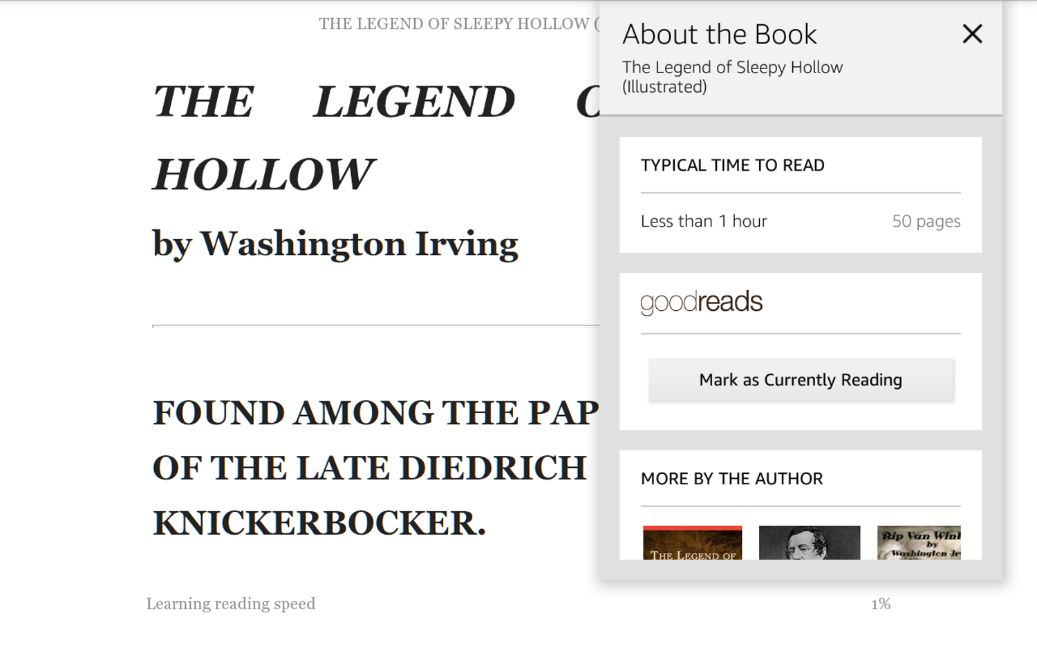
This screenshot shows the Goodreads integration menu that’s available from within your Kindle books after Goodreads integration has been set up. It basically makes it a lot easier to update your Goodreads shelves, ratings, reviews and so on, you no longer have to go to the Goodreads app or website to do those things.
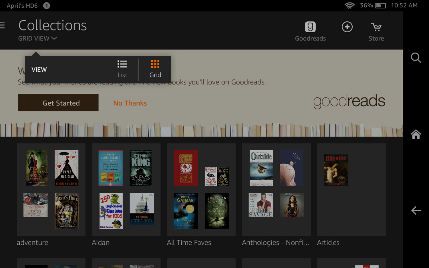
Here you see the 2014 Fire’s Collections view for Books. Note that it still has the same List/Grid view options, but the pop-up selection menu for these options looks a little different than on a second-gen Fire. Also note the Goodreads icon in the top menu bar, at the far right. In this screenshot, I’d yet to set up Goodreads integration. After I did, that Goodreads banner at the top disappeared.
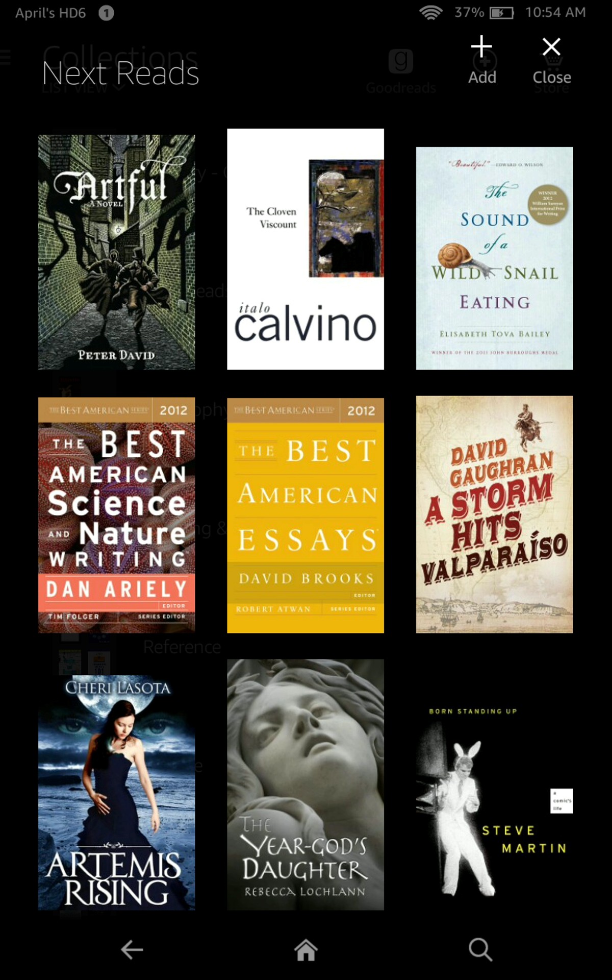
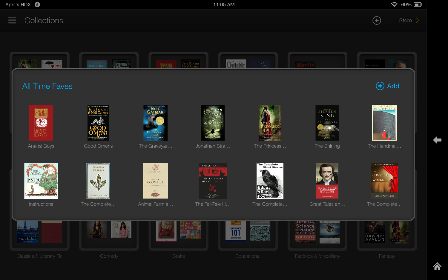
In this screen, I’ve drilled down from the main Collections screen shown above by selecting my own “Next Reads” Collection (a Collection I’d previously set up myself and had previously added Kindle books to). The Add and Close options are still there as before, but what I’d like to point out here is how much larger the book cover images are than on my second-generation HDX when I view a Collection. This is a HUGE improvement. See the next screen shot, below this one.
Below, you can see that when I open a given Collection on my second-gen Fire HDX, the pop-up selection menu is very small, and it’s difficult to read the individual book titles. Also, it’s not possible to enlarge the cover images just for the sake of deciding whether or not you want to download a given book; if you tap on any of the covers, the download immediately begins.
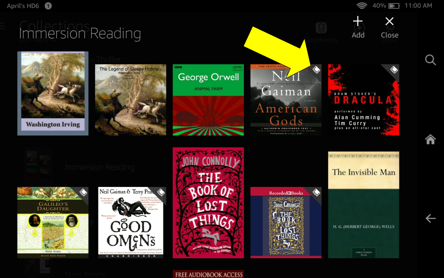
Below, you’re looking at my own “Immersion Reading” Collection of Audible audiobooks, which I had also previously created and populated myself, on the 2014 HD6. What I’d like to highlight here is the little Immersion Reading icon, indicated by the large yellow arrow. This icon appears in the upper right-hand corner of Audible audiobooks for which you have the matching Kindle book, to indicate you can use the Whispersync for Voice / Immersion Reading option for that audiobook. This new icon actually does away with the need for my custom-created Immersion Reading Collection, which I’d set up specifically to keep track of Audible titles for which I own (or intend to buy) the matching Kindle book.
Docs Options
Again, nothing Earth-shattering here but there are some differences compared to the second-gen Fire.
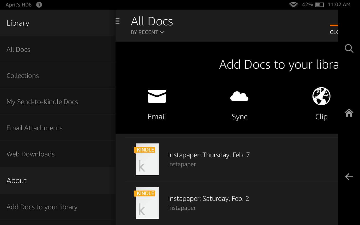
This screen shot shows the Docs sidebar menu open on the 2014 HD6. Note the “My Send-to-Kindle Docs” menu item; it displays a listing of the documents you’ve had sent to your Kindle using that feature. Send-to-Kindle is nothing new, but it’s being handled a little differently on the 2014 Fire menus and screens. There’s more information about Send-to-Kindle below, where I address the “Clip” menu item (looks like a globe, at the right, in the screenshot below).
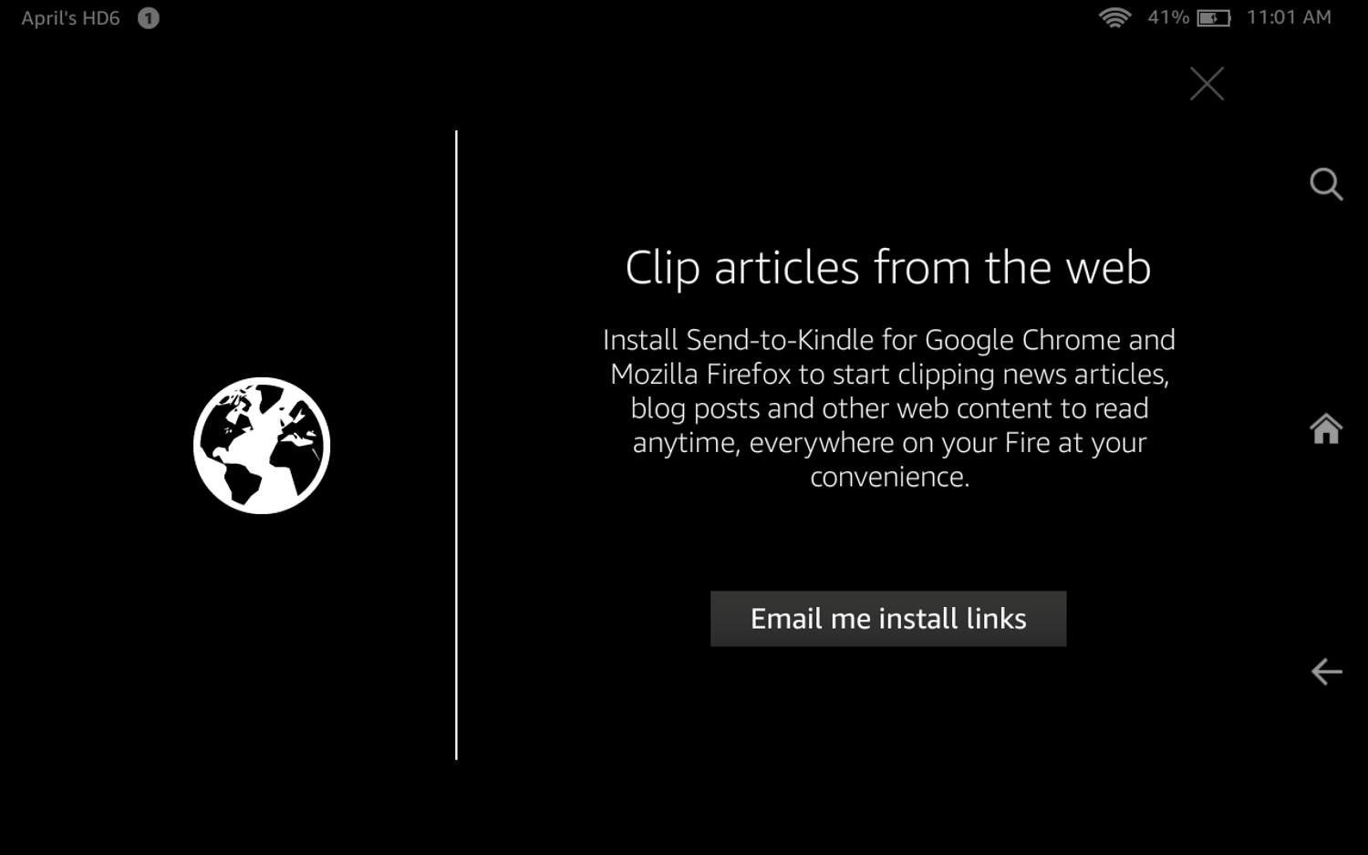
Here’s what you get when you tap that Clip globe (again, this feature was also available on second-generation Fires): a prompt to use the Send-to-Kindle widget in your computer’s Google Chrome or Mozilla Firefox browser (sorry, it’s not compatible with Internet Explorer or Safari). If you tap the “Email me install links” button, the links to get the widget will be sent to your main email account on file with Amazon. Open that email on your regular computer, in either the Chrome or Firefox browser, and follow its directions to add the Send-to-Kindle widget to your browser. Once it’s there, you’ll have a handy Send-to-Kindle button right there in the browser and when you click it, the page/content you’re currently viewing will be sent to your Fire as a pdf file, and added to the Docs menu under “Cloud”. Send-to-Kindle has been available for a long time, but the new menus make it a little easier to use.
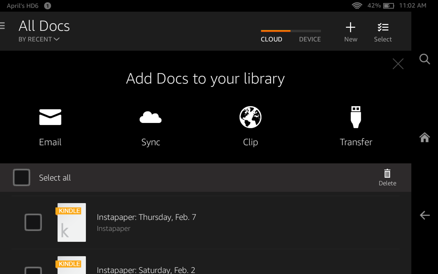
Here’s the new Add Docs selection screen, where you can bring docs down from the Cloud to your Fire. The feature and function haven’t changed, but they do look a little different; mostly, it’s just that the display is bigger. Remember, these screen shots came from the HD6, which only has a 6″ screen. Yet the larger icons and text make everything much more legible on the HD6 than on my second-generation HDX 8.9″. Compare to the same function on my second-generation HDX, below.
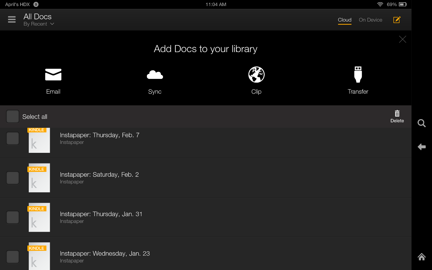
Here’s the same screen/function on my second-generation Fire HDX. So small!
Web / Silk Browser Options
There are two big improvements here.
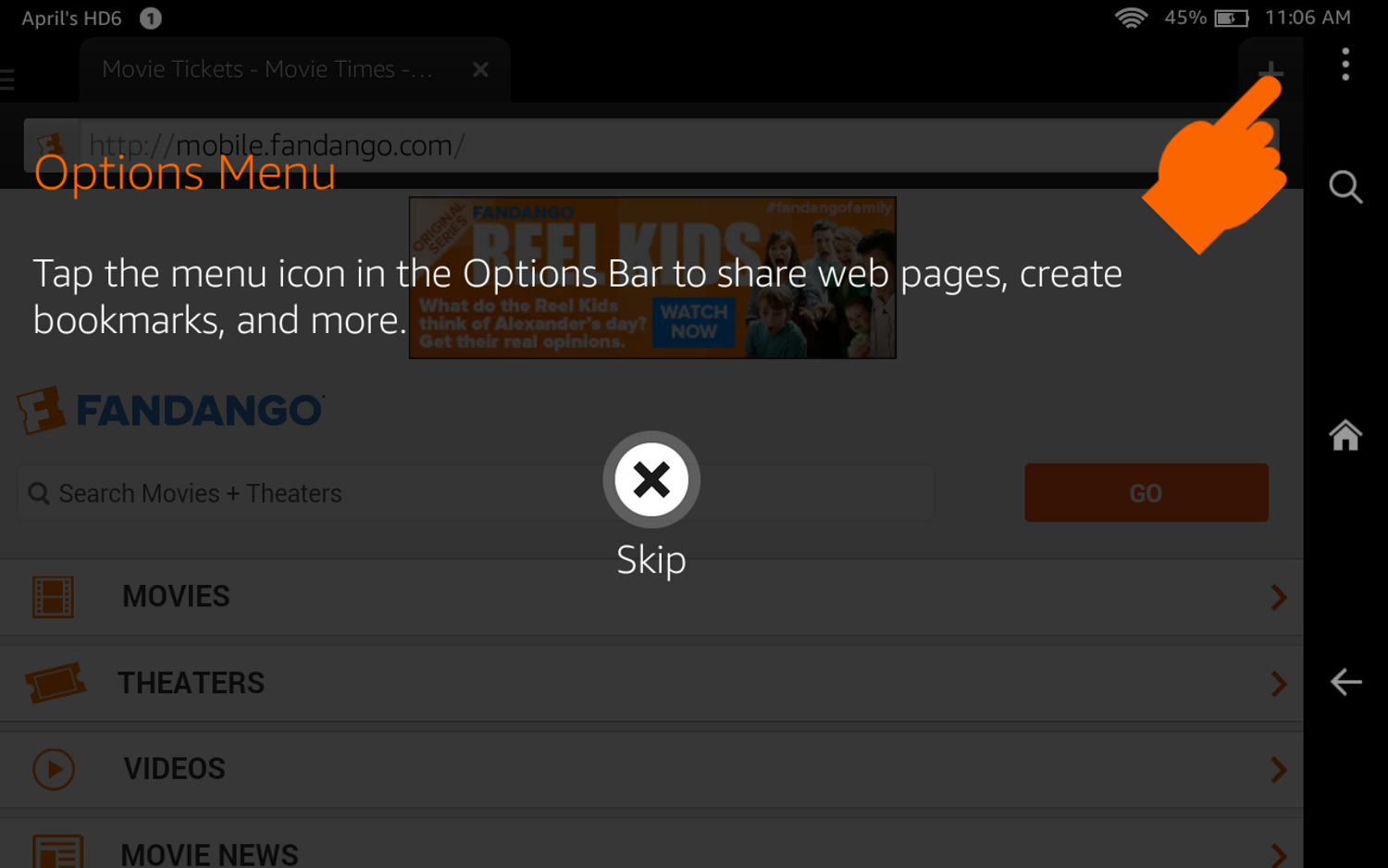
Here’s the screen you see the first time you access the Silk web browser on the 2014 Fire:
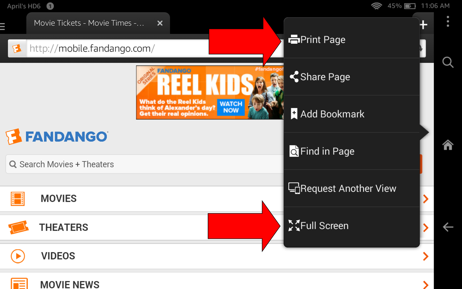
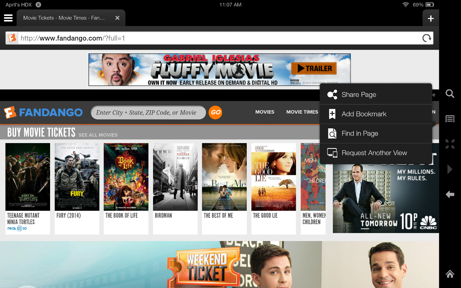
Here’s what’s on that Options menu. Note the two new menu items, indicated by arrows. “Print Page” works amazingly well, so much more seamlessly than on my second-gen HDX. When I selected it as a test, the Fire immediately located my printer on my home wireless network. I tapped to select it and was presented with a typical Print menu, with Options to print all pages, print select pages, print in grayscale, etc. etc. I could never get the Print function to work on my HDX in all apps and functions; only certain apps and fuctions seemed able to “see” my printer. That Full Screen option is used to expand the web page you’re currently viewing all the way out to the borders of the screen.
Here’s the same Silk browser Options menu on my second-generation HDX. Everything’s smaller, and it doesn’t have the Print Page and Full Screen options.
Music Player / Photos
There are no significant differences to the Music screens and options, other than integration with Prime Music for Amazon Prime subscribers. If you’re a Prime subscriber, you’ll find handy links to Prime playlists and radio stations along with the usual links to your own music files on the device and in Amazon’s cloud.
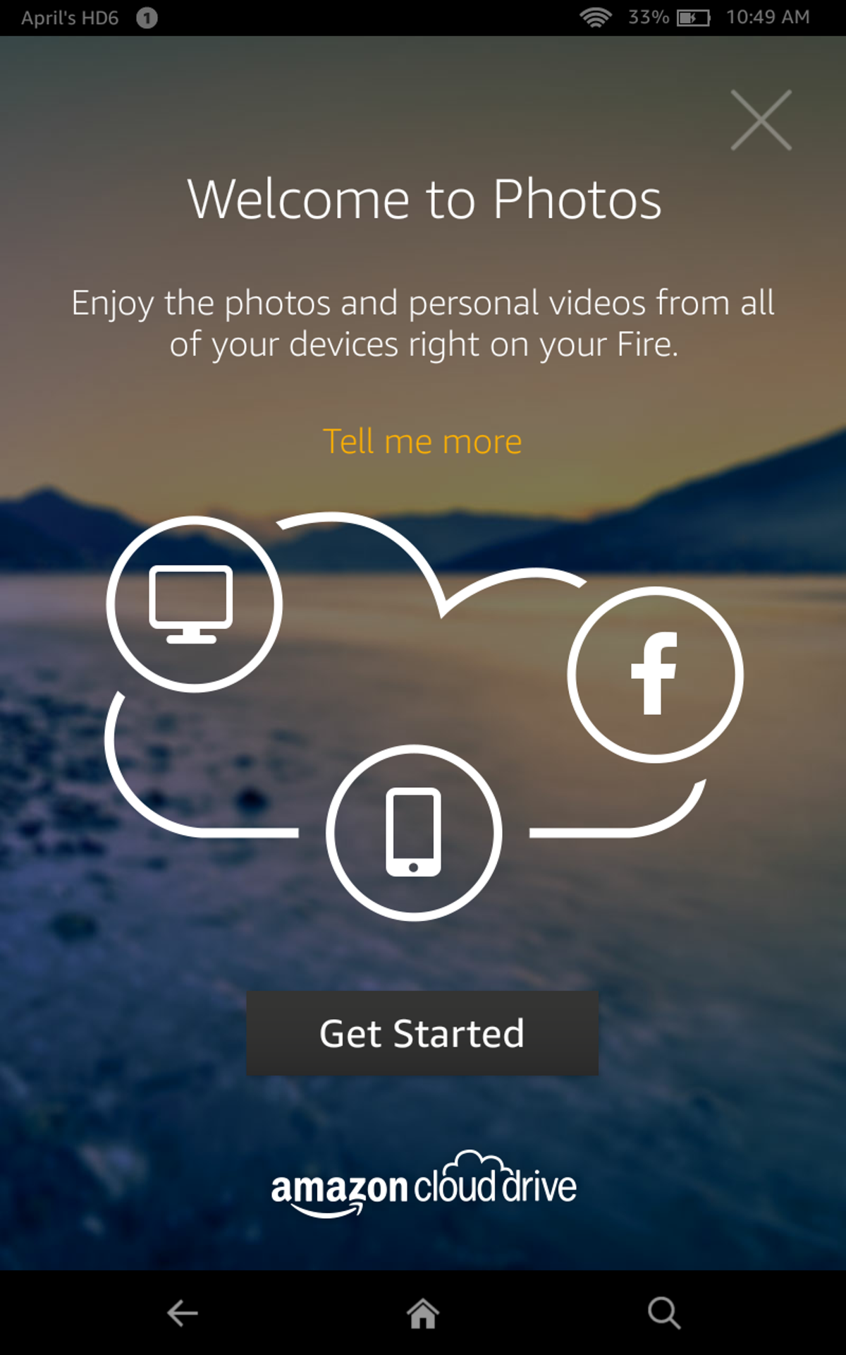
In the Photos area, there are some new options for adding photos when you initially set up the Fire tablet. The first time you access the Photos screen/tab, you’ll see this setup screen:
As you go through each of the setup screens, you’ll be prompted to link your phone, Facebook account, and other accounts to make photos you have stored on those devices/sites accessible on your Fire tablet. The link only makes them accessible, it does not automatically download everything to the device. But that’s an option that will be available to you after the device(s) and account(s) is/are linked.
Some Of These Changes Are Coming to Second-Gen Fires, Too
Amazon has announced an automatic software update is being rolled out to second-generation Fires to add some of the features and functions of the new line, but since I’ve yet to get the update on my second-gen HDX I can’t say which features and functions are included. After I get it, I’ll write a follow-up post.
Bottom Line: Worth the Buy?
Absolutely! I have no idea how Amazon managed to pack so much quality and functionality into the 2014 HD6 at a price point of just $99, but they did. I love my second-generation HDX 8.9″, but it can’t slip into a purse or bag as easily as the HD6. The HD6 is also a lot zippier in terms of processing power and response times.
Note that the first few times you use a new Fire tablet, the various content menus will take some time to populate. The larger your content libraries, the longer this process will take. But once your content is fully populated, viewing, downloading and using your content will be noticeably faster on the 2014 line.
In addition to the improvements and changes in software I’ve detailed above, there are some hardware changes. The screen display can now fill the entire display area, where in past models there was always a black border of unused space all around. The menu redesign helps to support this feature by eliminating that sidebar menu/options ribbon that frequently appears on prior generation Fires.
The volume and on/off buttons have been relocated to the sides of the tablet (instead of the back, where they are on my second-gen HDX), which makes it a lot harder to press them accidentally. It also makes it a lot easier to take a screen shot by pressing the power and volume down buttons simultaneously. This same feature is there on my second-generation HDX, but it was kind of hit-and-miss. If I didn’t press the buttons with the exact right level of pressure and at the exact same instant, the screenshot wouldn’t work. On the HD6, it never fails!
I would not hesitate to grab a 2014 HD6 as a holiday gift for a tween, teen or adult. It’s an amazing value!
