 The new, second generation Kindle Fire HD 7″ model is already shipping, and it includes the new Fire 3.0 Operating System, a.k.a. the Fire 3.0 OS. There are some significant differences (and improvements!) between Fire 3.0 and the previous version, so let’s take a look.
Carousel
The links in the top menu ribbon have been made smaller so they all fit on the screen when viewing in landscape mode. A downward swipe from the top of the screen still opens the settings menu.
Instead of “Favorites”, the new system has a “Home” area, which provides essentially the same function: a separate screen to store quick links to your favorite apps and content.
Where before there was a small tab at the bottom of the carousel screen and you’d swipe upward on that tab to open the “Favorites” screen, now the top of the Home screen actually peeks out a bit at the bottom of your carousel screen. As before, you swipe upward to access this area. Long-tap on any item there and select “Remove” to remove it from the Home screen (this does not remove the item from your Fire, just the Home screen).
Shop Link
There’s a new, better interface to the Amazon site when you tap the Shop link. Recommended/featured content displays in a rotating carousel slideshow. You can swipe left or right to page through the items, and tap the large image of an item that’s currently at the center of the slide show or tap any of the small icons shown beneath to open the item’s product page.
There are still department links, but these are now located at the left-hand side of the screen instead of the bottom. This opens up more space in the main display area, and makes the store easier to navigate overall.
Content Type Pages – General Similarities
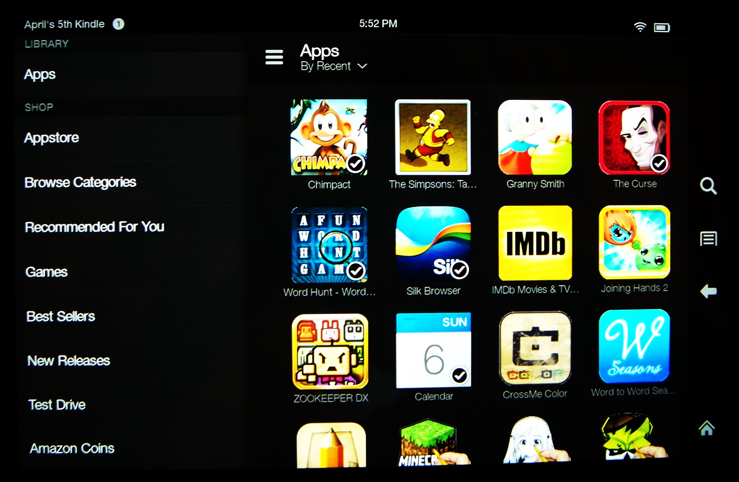
You’ll now find a context-sensitive pop-up menu available in every one of the different content type pages (e.g., Books, Apps, Videos, etc.). This menu is accessed via the small icon at the upper left-hand corner of the content page; it looks like three horizontal lines. In the screen shot below, I’ve tapped that icon to open the context-sensitive menu in the Apps page.
The specific items included in the context-sensitive menu vary according to the content type, but every one has links for Shop, Settings and Help. The topmost Shop link takes you to the main Amazon digital storefront for the specific type of content you’re viewing, while specific links for categories, featured items and sales take you to those specific pages on the Amazon site. The Settings link opens the main Settings menu for the Fire, and the Help menu opens a page with links for the user’s guide and various support links that are relevant to the specific content type you’re viewing.
Notice that the old menu icon is still there at the far right. This one is now used to toggle the display of your items from list view to grid view. For some reason this feature has been removed from the Games, Docs and Videos pages, but it’s there for all the other content types. In the screenshot above, I’ve set it this option to grid view.
Most Recently Accessed Menu
The Most Recently Accessed items menu (I’ll refer to it as the MRA menu from now on) is a handy new feature that’s available from all the main content type pages. To access it, just swipe left from the far right-hand side of your screen.
A Complete Docs Overhaul
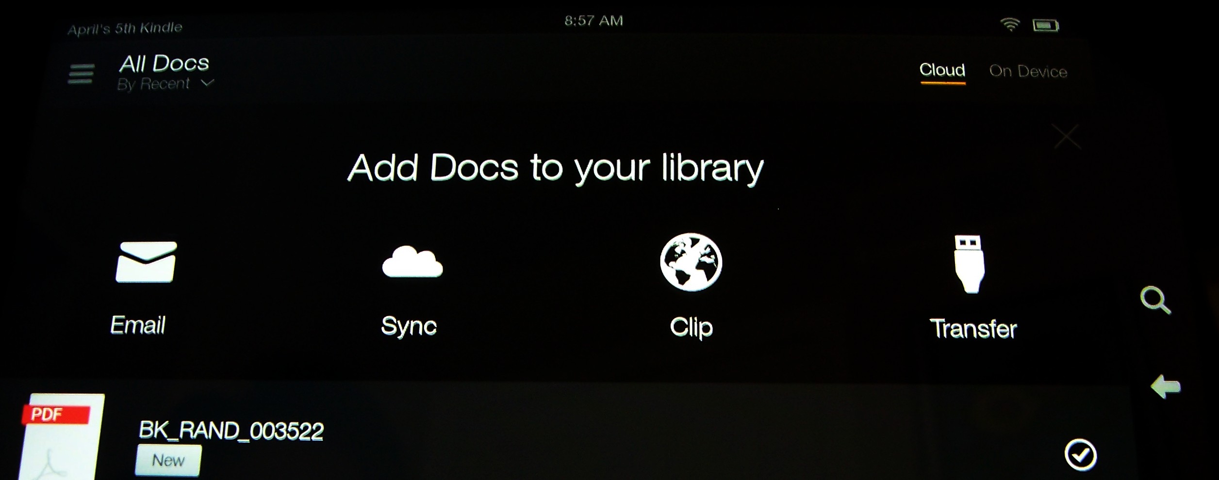
The Docs page and feature has been completely redesigned and simplified in the new operating system. As the screenshot below demonstrates, there are links at the top for each different method you can use to get docs onto your Fire. Tap each icon to view directions for transferring documents using each respective method.
Email – Amazon has greatly simplified this method for document transfer by assigning a single Kindle email address to each user instead of separate addresses for every Kindle or Fire device you own. Now you can simply email documents to [your Amazon username]@kindle.com to send a document to Amazon’s cloud, and from there it’s available to all of your Kindle or Fire devices.
Sync – this syncs to your Amazon Cloud docs folder via the free Cloud Drive desktop app (available for either Mac or PC). When you tap on the Sync icon, if you’ve never used this feature before you’ll see a brief description of the service, along with links to email yourself the download links for the desktop app. All Amazon customers get 5GB of storage space on their Cloud servers for free, though many don’t know this and aren’t using it. Once you install the desktop app, you’ll be able to easily upload and download documents, photos and personal videos to the Cloud from your computer through the app. Then use this Sync link on your Fire to sync your Cloud Docs folder to your Fire.
Clip – another great new feature! This menu item gives you one-tap access to the free Send To Kindle app when viewing web content through the provided Silk web browser. The first time you use it you’ll be shown a brief description and download links. Once you’ve downloaded the Send to Kindle app and installed it, you’ll find a Clip icon in the web browser that allows you to save most web pages to your Fire as documents, for later reading on- or offline. I expect some text editing and word processor apps may also have Clip enabled because on my PC, Send to Kindle works with most of my computer programs that have print functionality, but I’ve yet to see it in any Fire apps myself.
Transfer – tap this icon to view simple instructions for transferring documents from your computer to the Fire.
Quiet Time
Quiet Time, accessed via the Settings menu, is yet another terrific new feature that’s so useful, you’ll wonder how you got along without it before. With Quiet Time, you can silence all audible alarms and app alerts while still having access to volume controls for the content you’re using (e.g., audiobooks, videos, apps, music, etc.). Never again will you be engrossed in a video and suddenly hear a hokey “ding-dong!” or other sound effect to alert you of progress in some app.
For example, in The Simpsons Tapped Out, if you have audible alerts turned on, every time a character completes a task you’ve set for them you’ll hear Homer say, “Better them than me!”, even if your Fire is asleep at the time. The only time you wouldn’t hear it on a first-generation Fire was when the Fire was completely turned off. With Quiet Time, you can temporarily turn off those types of alerts when you want to be totally focused on specific content.
November Update
An automatic, “over the air” update to the new operating system is coming in mid-November, and it will add even more functionality, including the long-awaited Collections function for books, apps and videos.
“Over the air” updates are delivered to Fires automatically via Wi-Fi, usually rolled out to Fire owners in groups to avoid overloading Amazon’s servers. When the update is released for your specific group, the next time you turn on your Fire with Wi-Fi enabled, the update will be downloaded and installed to your Kindle Fire OS 3.0 device automatically.


